I like to make greeting cards and I like to have them on hand for just the right occasion. I, often, have "saved the day" by having a card available and I enjoy giving something that might mean more than a store bought card. I have never had a very good system for my cards though. Now I do! I organized them so that I would have categories that made sense to me. I also found out that I had big gaps in categories that I should have cards for but didn't. So, it also helps to save money if I can make cards instead of pay outrageous store prices for them.
Everything that I used to make this project, I already had. I didn't buy anything. I had wanted to have a cute basket with no top, but after contemplating decided that I would save money and allow for "stacking" buy having a lidded box. The box I used was my son's athletic shoe box, larger than a regular shoe box, it measures 13-1/2" x 10-1/4" x 5-1/2". This size allows for all my cards and envelopes, as of today. It is also big enough for my largest card, which is 5" x 7".My box was a little beat up, but my plan was to cover it with black spray paint anyway! I needed to reinforce the corners and fix up the tears, so I did that with duct tape! Then I spray painted the whole box, except the inside, with flat black spray paint. Now, the areas with the duct tape do have edges that can look a tiny bit different than the rest, but it really does work well overall. I love, love, love spray paint and believe that a little spray paint can make most anything look good!
I pulled out all my cards and put them in piles to use for categories. My cards created more categories than I thought they would. 
I measured the inside of the box and made dividers for the number of categories that I had. My dividers are 9-1/2" x 4" and they are cut from regular white cardstock that I already had. I made them shorter than the box because I knew that I would want my category labels to stick up.
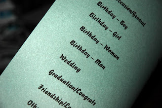
I printed the category titles onto a simple piece of lightly decorated card stock with a nice simple font. I cut these out, making sure to cut them all the same size.
My categories ended up being:
*Tags (for on gift packages)
*Birthday - Boy
*Birthday - Girl
*Birthday - Man
*Birthday - Woman
*Wedding/Anniversary
*Baby
*Graduation/Congratulations
*Get Well
*Sympathy
*Thank You
*Friendship/Love
*Other
*To Alter (these are cards that need to be finished, old store greeting cards that I can use as backing, or cards that I just think need something done to them before they are truly useable)
*Envelopes
*Any Occasion/General (these are great to keep on hand for a quick transformation into something more specific)
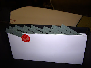
I added one little embellishment to each divider after I stapled the label on at an angle. I used an epoxy flower on this one, but each of them has something different, sometimes correlating to the category title.
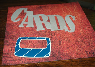
Now to start decorating the outside of the box! I used chipboard letters that spell "cards" and a chipboard file frame. I picked out some cute paper that I had been saving from an Archiver's exclusive design pack. This is going on the front and side of the box.
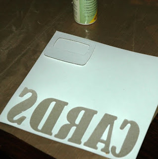
I glue the chipboard onto the paper. Make sure that anything which has a "right side" is glued right side down onto the paper. I don't know that the glue type matters as long as it is a glue that is not going to make the paper buckle. Then I cut out the chipboard; I'm sure that it could be done with a scissor but I used an exacto-knife with a cutting mat.
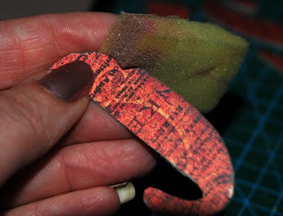
I wanted my chipboard to have a nice blended look, so I used a similar colored ink pad and I dobbed (is that a word?) the ink pad with a sponge and wiped the edges of the chipboard a bit with the sponge.
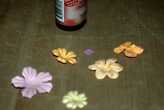
Prima flowers can make everything look a little sweeter. So, I chose a few flowers for their shape not their color, because I knew that I didn't have any the color I wanted. I sprayed them with a Terra Cotta walnut ink. I still didn't have the color I wanted.
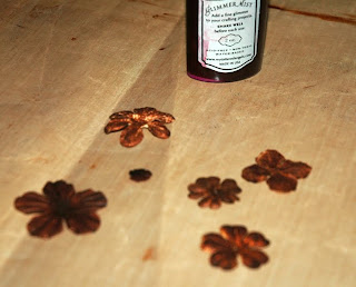
I then sprayed them with some glimmer mist in black cherry. That gave me the color that I was looking for!
I used a white ink pad and stamped some butterflys and sayings on the box. My stamping did not come out great because of the flexibility of the box! I would recommend a block or something stable on the backside when working with something that is difficult to lay flat. I didn't want to wreck my corners by forcing the areas that I wanted to stamp. I actually think it gave it a bit of a whimsical look. I also repaired some areas by adding bling!
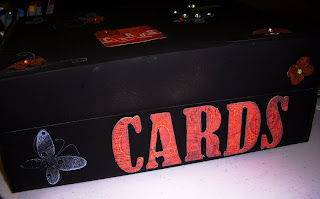
The chipboard and flowers got glued to the box! I added sparkly stones to the centers of the flowers.

The short side of the box got the chipboard file frame with paper added behind it and sticker letters, to again form the word "cards". This way no matter which way I stack my box on a shelf, I will know that it is my card box. I also added another bling stone to that frame.
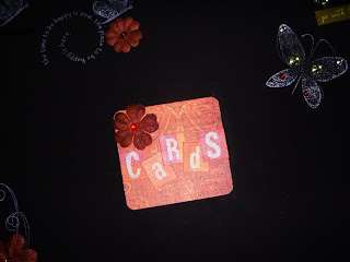
On the top of the box, I added more flowers, bling, some epoxy stickers, and another piece of paper with more letter stickers. Guess what they spell? Yep, you guessed it, cards again! I don't think it would be possible to not know what was in this box!
My projects always turn out quite a bit different than what I am imagining. This one actually turned out a bit sweeter than I thought it would! So, now the box is finished and I my cards are completely organized!




Good for you! I may just have to try this out. I have a basket for swap cards, two boxes i got as kits from QVC long ago and a basket for my cards and then another for cards that are not completed! (I do that alot) Would be nice to having a stacking file system and can coordinate with my craft room how i want!
ReplyDeleteI came by your blog to introduce myself. My name is Sherry and I am a new Bloggerette Sorority Sister. I have only been blogging for 3 weeks so I missed the rush, but I look forward in joining in on the events to come. I would be honored if you came by for a visit at http://scrappingwithsherry1.blogspot.com/ Hope to see you there!
Take Care~ Sherry
HI Jeanne-
ReplyDeleteThanks for leaving me such a nice comment. I love to repurpose and have a shoebox- although not as pretty as yours to hold my cards. You really planned and thought it out. I especially like that you used your computer to make the decorative font section tabs.
I also find that my projects sometimes do not come out as I expected them too, either. It is great when they come out better, but oh, so frustrating when they don't.
Hope you have an enjoyable weekend.
My best-
Diane